Link to the visualization : Good Governments Help People Succeed
“The care of human life and happiness, and not their destruction, is the first and only object of good government.” - Thomas Jefferson
Purpose of Visualization
How can we measure the success of a government and what criteria should be used to label a government as “good government” ?
Gross Domestic Product (GDP) is commonly used as a metric to compare two countries and their government. Gross Domestic Product is the total value of goods and services provided by a country during one year. The more the output and GDP of a country, it is implied that better is their government and that country is ranked higher in the government ranking.
But, metrics like GDP which rely on economic progress of a country do not explain how is the government good or bad for the people living under the rule of that government. We can not conclude that people of a country with a high GDP are living a high quality of life.
To learn more about the quality of government there is need to look at other factors like social well being and the impact of government on individual development.
This visualization helps in learning about the various measures which make a good government.
General Dataset Information and Collection
The dataset was provided as part of the dataviz challenge organized in partnership with the World Government Summit.
The data set can be accessed from this location What Makes A “Good” Government?
The data was collected and aggregated from various organizations: Food and Agriculture Organization of United Nations(FAO), World Bank, CIA World Factbook, Happy Planet Index, United Nations Development Programme, World Happiness Report, Boston Consulting Group (BCG) , Heritage Foundation , Freedom House.
Some features of the dataset:
The dataset has various measures to access the quality of governments all around the world.
The dataset contains information for 200 countries for the various measures.
Some of the attributes present in the dataset are country name, population, GDP, GINI index, HDI, health and education expenditure, economic freedom, etc.
Target audience and users for the visualization
The dataset can be used by any person around the world to learn more about the performance of their government.
The data would be helpful for the leaders and people in power to get feedback about their performance and know the areas of improvement.
It can be used by the various country leaders in the world to make decisions and policies for the development of their country and future of their people.
Questions people are interested in !!
The original goal of measuring the success of a government would require answers to questions listed below. Based on the various measures provided in the dataset, the following questions would be helpful in learning more about the government of a country.
What measures other than GDP can be used to measure a government’s performance?
How can we learn about what impact the government is having on the people’s lives of that country?
How do governments compare in any particular region of the world (Africa,Americas,Asia,Europe and Oceania)?
Which countries are ranked higher based on the individual measures like GDP,HDI,Economic Freedom, Gini index?
Is there any correlation between various metrics like HDI,Economic Freedom score,GINI index and GDP?
How do measures like HDI, GINI, Economic Freedom score change relative to GDP over a period of time for the various countries?
How the different countries differ on change of HDI, GINI index and Economic Freedom score with respect to GDP and each other of them?
Using the visualization tool to answer the user questions !!
The visualization makes use of three more metrics other than GDP to learn more about impact of government on individuals.
Human development index(HDI)
It is a statistic composite index of life expectancy, education, and per capita income indicators. These indicators are used to rank countries into four tiers of human development. Countries with high lifespan, education level and GNI (PPP) per capita are ranked higher as per the index.
Economic Freedom Score
It is used to measure the degree of economic freedom in a country on a scale from 0 to 100. Economic Freedom Score is based on four complex sets of indicators: Rule of Law, Limited Government, Regulatory Efficiency and Open Markets. It tells about how any government promotes the freedom to work, produce, consume, and invest in any way for any individual in that country.
Gini Index
This metric is used to learn about the status of economic inequality, measure income distribution or wealth distribution amongst a population. Whether the distribution of individual or family income is equal or not can be derived using this measure. Lower value of GINI index means distribution of wealth is more equal in that country as compared to countries having a high GINI index.
The visualization tool helps in answering the above questions through it various features. The main features of the tool and corresponding visualizations for them gathered with the help of the tool are described below.
There are three main types of visualizations present in the tool.
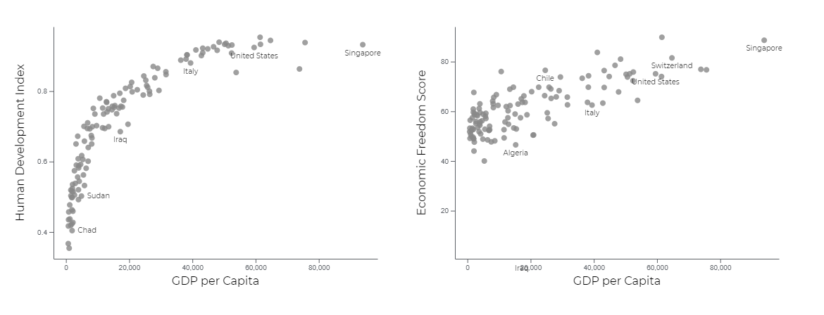
1) Scatterplots : These can be used to learn about correlation between various measures.
The visualization below shows how Human Development Index and Economic Freedom Score change with respect to GDP per capita for a country.
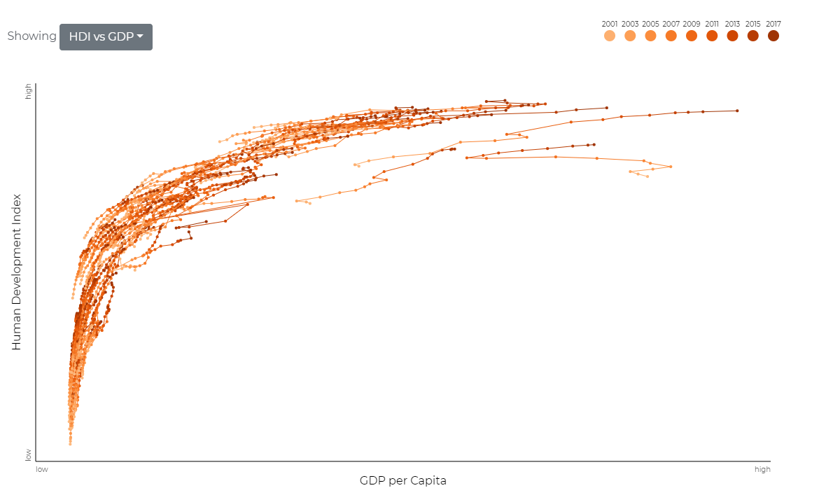
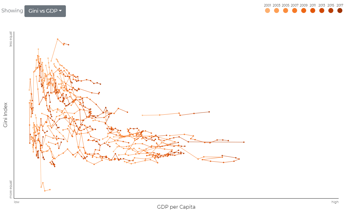
2) Collection of line charts : These can be used to see the progress over time for various measures.
The visualization below shows how Human Development Index changes with respect to GDP per capita for different countries over the years.
The visualization below shows how GINI Index changes with respect to GDP per capita for different countries over the years.
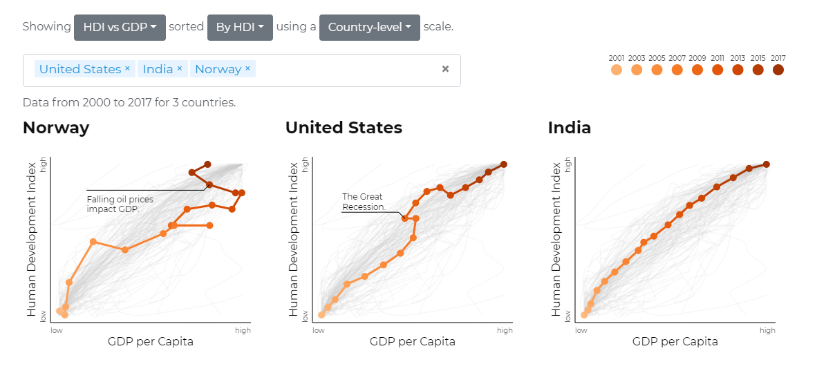
3) Linecharts for comparsion : These can be used to compare various countries over different measures. This can be done at country level or global level to scale the measures accordingly. The results can also be sorted on various measures to get more insights.
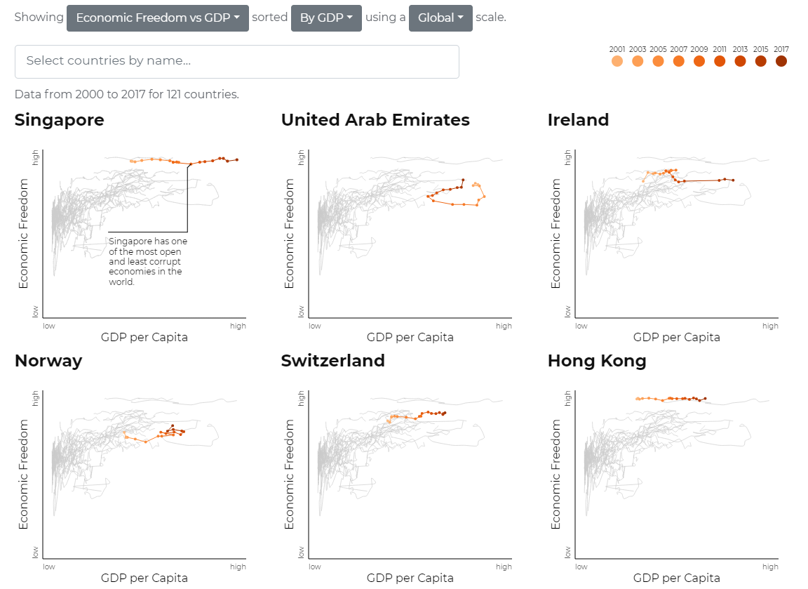
The visualization below shows how Economic Freedom Score changes with respect to GDP per capita for top performing countries based on GDP.
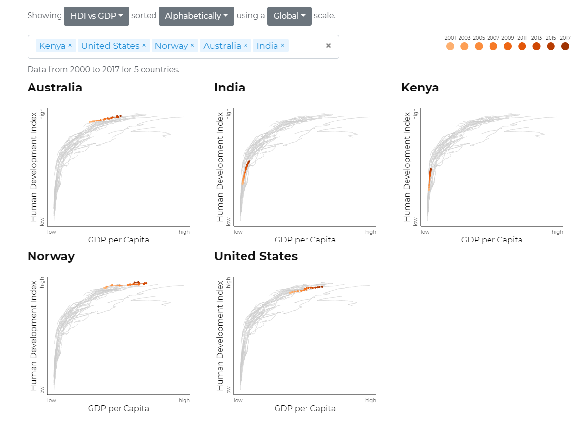
The visualization below shows how the countries in various regions perform based on change of HDI with respect of GDP per capita. One country from each region was selected for this visualization. The scale used here for comparison is global scale for measures.
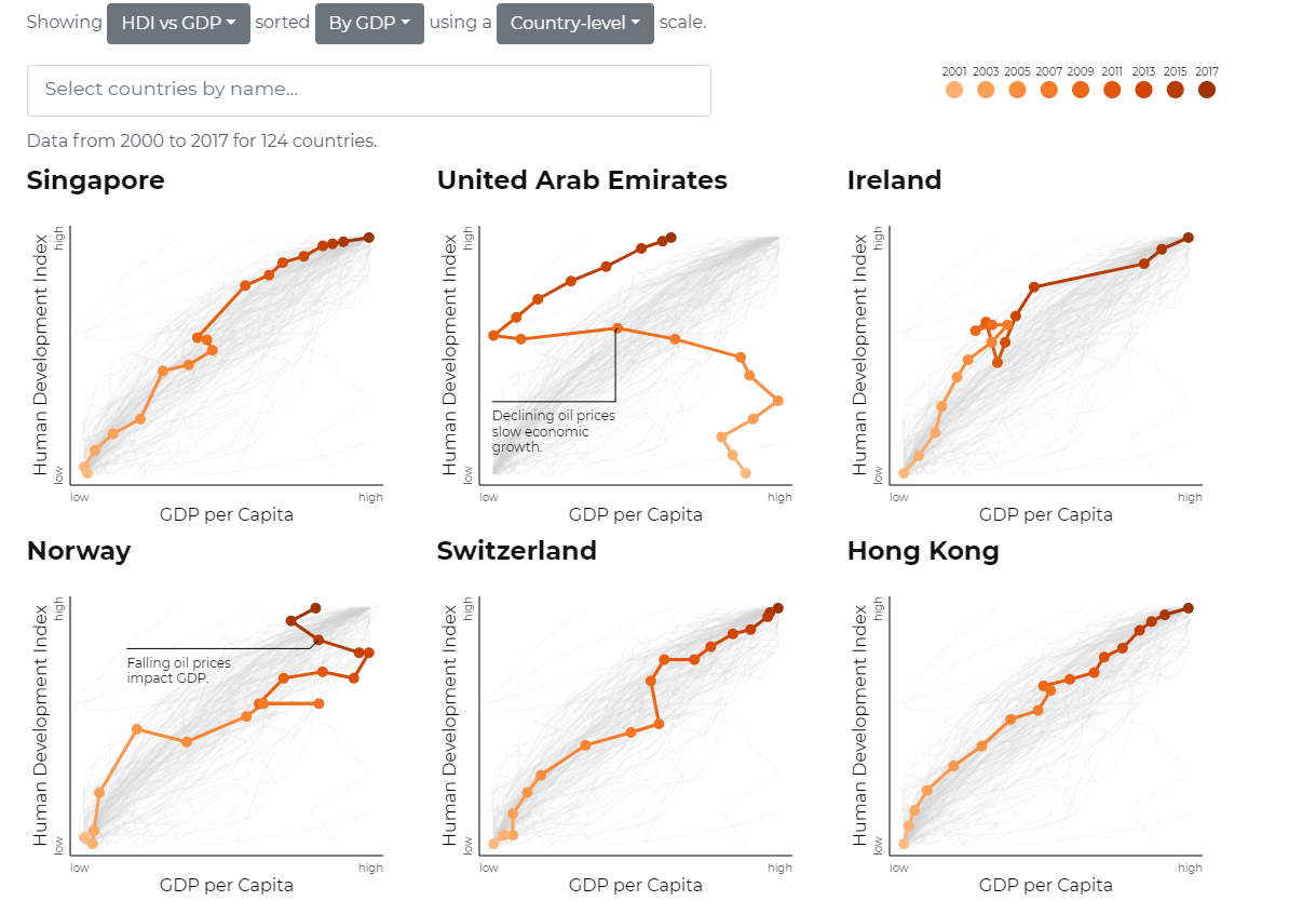
The visualization below shows how Human Development Index changes with respect to GDP per capita for top performing countries based on GDP.
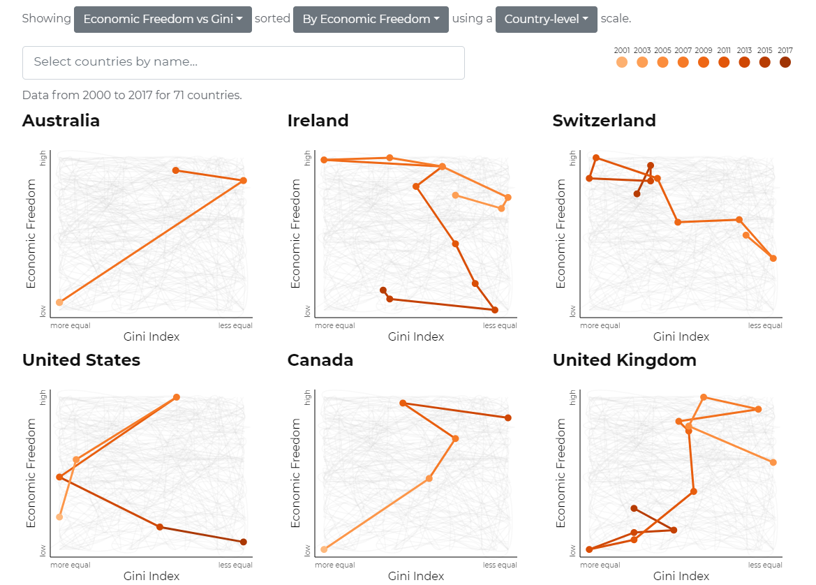
The visualization below shows how Economic Freedom Score changes with respect to GINI index for top performing countries based on Economic Freedom.The scale used here for comparison is country-level scale.
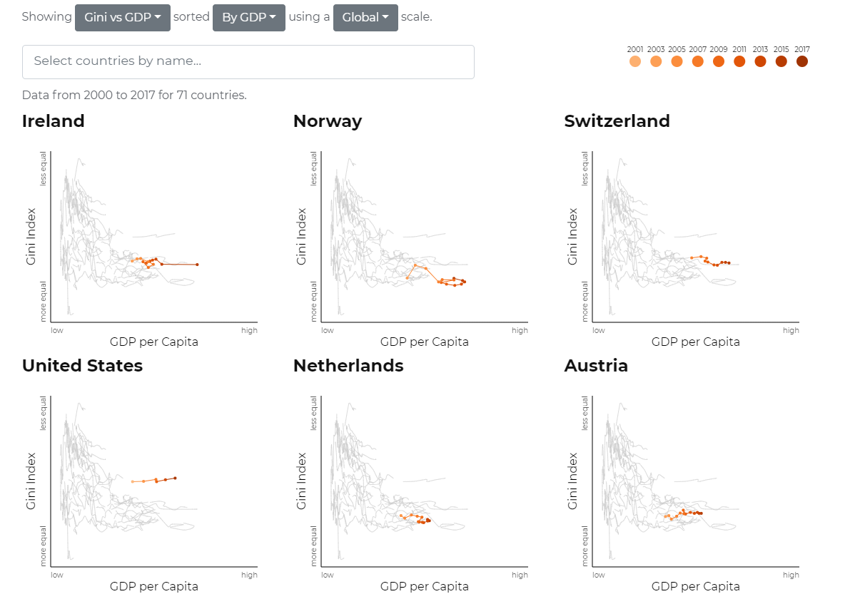
The visualization below shows how GINI index changes with respect to GDP per capita for top performing countries based on GDP.
Good aspects of the visualization
All the plots in the visualization are well labeled. Both the axis in the plots have descriptive names. It is easy to understand what measures are being visualized through the plot.
The points on the plots either have labels or have tool-tips for more information.
The comparison plots have appropriate title at the top for the country names along with the labels for various measures.
The comparison plots for the various countries allows use to select any metric and sort the results using any other metric. This is very useful to learn more about the various countries and rank them based on various measures.
The comparison plots provide two options for scaling : country-level and global level. As the values of measures vary for different countries,this feature helps in analyzing the data with respect to global level and country level as required by the user. This handles the range of values for different measures appropriately.
While performing comparison, the number of countries for which data is available is mentioned at the top for the user. So, the user has an idea of what is the size of the group used for comparison. This figure changes on various measures based on availability of data.
The scale for both the axis is chosen appropriately based on the type of measure being plotted. This adjusts the plot appearance according to the range of values.
There is a tool-tip for additional information about the points on the scatterplot and line charts. For scatterplot, the tool-tip shows the value being referred to at the instance. For yearly charts, it has the year information to tell the year also for that point. This helps the user to learn more about a particular country in the visualization.
The over the years line charts provide the feature to highlight any country from the set of all countries. This allows user to focus on a particular country at a time.
Thing which need improvement
While the line charts over the years help us in learning the progress of a country, having all of them in a single chart can be confusing for the user to interpret the data. The plot could have had the option to remove all other countries rather than just highlighting one of them.
The highlighting of a particular country in the line chart shows information about that country. But, it is difficult to navigate over different years for that country while highlighting the same country. This could have been avoided by allowing user to select the line for the country and keeping it constant until the next country selection.
The color palette used in the legend for the years sometimes makes it difficult to differentiate between two consecutive years. This makes it very difficult to compare two consecutive years performance for a particular country. It could be improved to support more years and add clarity in the different years.
The comparison line charts connect the various points of different measure over the years. As, the line progresses over time, it makes use of the time measure(legend) along with the x and y measures, it is sometimes difficult for user to understand the flow of the charts using them as values are changed over time.
For few measures in the comparison plot, data for some countries is not available, currently the country is not found in the list of selection, but the same could be communicated to user by a user friendly message.
All images used in this post were created using the following visualization tool.